Font Assets
TextMesh Pro has its own Font asset format. When you add a font – typically a TTF file – to a Unity project, Unity will import it as a font asset. You then have to use the font asset creator to generate a TextMesh Pro font asset from it. Afterwards, you no longer need the original TTF asset. However, it is a good idea to keep it in your project, in case you need to recreate the font asset.
Font Asset Creator
The TextMesh Pro font creation window can be opened in the editor via Window / TextMeshPro — Font Asset Creator. The window presents you with a few font settings, a generate button, a texture preview, and a button to save your new font asset.
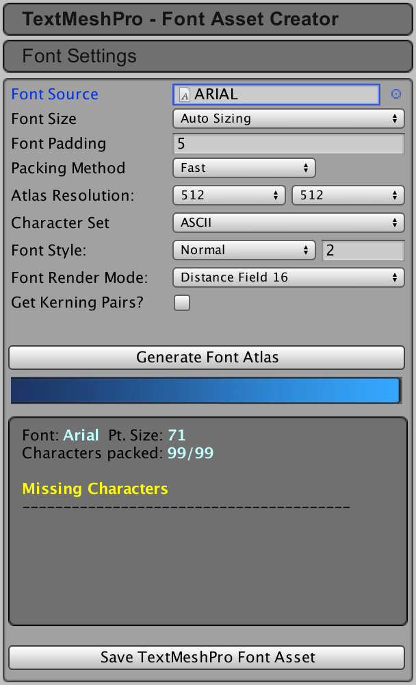 Font asset creator settings.
By default, the window is configured to create a signed distance field (SDF) font asset. The generated textures for these fonts contain contour distance information, which looks like grayscale gradients. When rendered with the right shaders, this will produce high-quality text with support for effects like outlines and drop shadows.
When saving font assets, you have to put them in a specific folder, defined in the settings asset. This will ensure that TextMesh Pro can find them and that they are included in builds.
Font Source
You must select a font from which to generate a Text Mesh Pro font asset. The font source is only needed to generate the font asset. It won’t be included in builds, unless you also use it elsewhere or put it in a Resources folder. The Text Mesh Pro package includes ARIAL, Bangers, and IMPACT as example font sources.
Font Size
You can control the font’s point size that will be used to generate the font’s texture. You can either manually set a custom size or use automatic sizing. Auto Sizing will try to use the largest point size possible while still fitting all characters on the texture. You typically use Auto Sizing for SDF fonts and Custom Size when you want pixel-accurate control over bitmap-only fonts.

 Auto vs. custom font size.
Font Padding
Characters in the font texture need some padding between them so they can be rendered separately. This padding is specified in pixels.
Padding also creates room for the SDF gradient. The larger the padding, the smoother the transition, which allows for higher-quality rendering and larger effects, like thick outlines. A padding of 5 is often fine for a 512×512 texture.
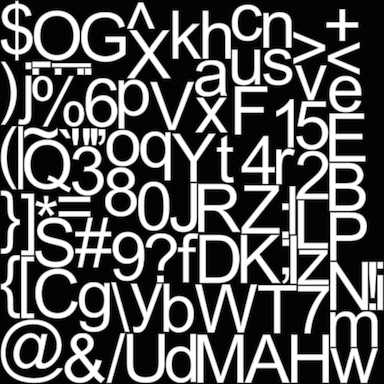
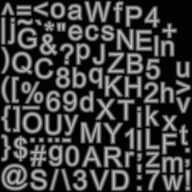
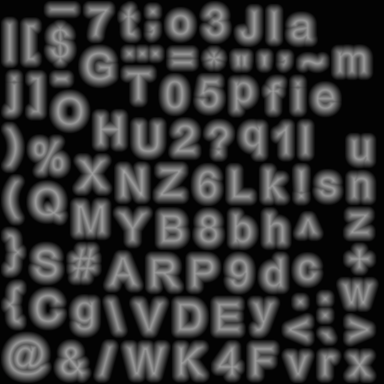 Padding 0, 5, and 10 for an SDF font.
Packing Method
Optimum packing will find the largest possible automatic font size that still fits all characters in the texture. Fast packing is a bit faster but might end up using a smaller font size. Typically, you use fast when trying out settings and optimum for the final result.
Atlas Resolution
When using an SFD font, a higher resolution results in finer gradients, which produces higher quality text. For most fonts, a 512×512 texture resolution is fine when including all ASCII characters.
When you need to support thousands of character, you will have to use large textures. But even at maximum resolution, you might not be able to fit everything. In that case, you can split the characters by creating multiple font assets. Put the most often used characters in a main font asset, and the others in a fallback font assets.
Character Set
The characters from a font file aren’t automatically included in the font asset. You have to specify which ones you need. You can select a few predefined character sets, or provide a list of characters yourself.
The presets include the visible characters of the ASCII and Extended ASCII character sets. You can also choose common subsets of ASCII, limited to lowercase, uppercase, and only the numbers and symbols.
The other options give you complete control over which characters to include. You can specify character ranges, using either decimal of hexadecimal numbers. Or you can explicitly list each character.


 Custom character sets.
You can also use a text asset, which should contain all the characters that you want included in your font. This allows you to save your character set.
 Using a character set file.
Be sure to include the space character, unless you really don’t need it.
Font Style
You can choose between a few different font styles. These settings are for bitmap-only fonts. You can configure the styles of SDF fonts via shaders instead. You can choose between bold, italic, bold plus italic, and outline. You can control the strengh of the boldness and the outline.
Font Render Mode
The distance field modes create SDF textures for use with SDF shaders. The characters are sampled at high resolutions to create good gradients. 16x is the default and adequate for typical use. 32x is slower to generate but can produce better quality for complex or small characters.
The other modes directly render characters to bitmaps for use with bitmap-only fonts. Raster mode doesn’t use anti-aliasing while smooth mode does. Both have a variant mode with hinting, which aligns character pixels with texture pixels for a crisper result.
Get Kerning Pairs?
You can choose to copy the kerning data from the font. This data is used to adjust the spacing between specific character pairs, to produce a more visually pleasing result. Note that many fonts do not have kerning pairs.
Font Asset
TextMesh Pro font assets contain all the information that TextMesh Pro needs to layout and render text.
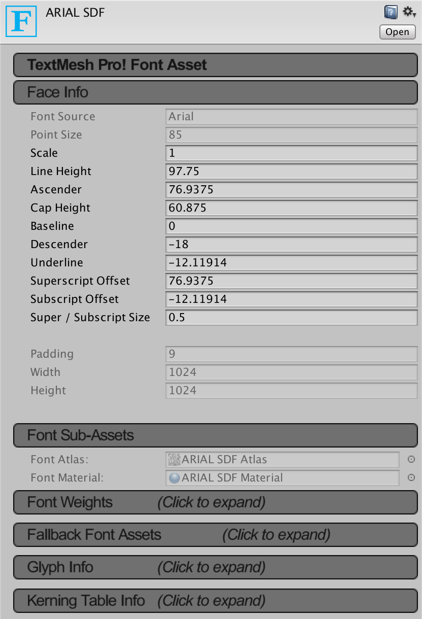 The default ARIAL SDF font asset.
Face Info
Face info contains information about the font asset. You can see the name of the original font, the point size and padding used to generate the asset, and the size of the atlas texture. These values cannot be edited.
Then there are some metrics that are extracted from the font, which you can adjust to fine-tune the font or to correct weird values. Sometimes fonts are designed with strange metrics which you’ll have to tweak to make it usable.
 Line metrics.
The basline is the horizontal line on which characters sit. The ascender describes how far above the baseline characters can extend, which also defines the top of a line. The descender does the same, but below the baseline. The line height defines the distance between the tops of consecutive lines. If it is larger than the size of the ascender and descender combined, there will be a gap between lines. If it is smaller, then characters from different lines could overlap.
Underline dictates where underlines will be placed, relative to the baseline.
The superscript and subscript offsets are used to adjust the baseline for superscript and subscript text. Their size is a factor that is used to scale such text, relative to the normal font size.
Font Sub-Assets
Each font asset also contains two sub-assets. These are its texture atlas and its default material. You should not edit these directly.
Font Weights
You can control how bold and italic changes the appearance of the font. It is possible to select different font assets to be used for bold, italic, and bold with italic font variants. If you do not specify font variants, fake bold and italics will be used instead.
 Font weight settings.
You can also adjust the weight and spacing of the text. The weight is added to the dilation used by the SDF shaders. The spacing is added to the space between characters. You can define these values for both the normal and fake bold style.
The Italic Style is used to create a fake italic font variant by slanting the character sprites. You can control the strength of this effect.
Tab Multiple controls the tab size. It is defined as a multiple of the width of the font’s space character.
Fallback Font Assets
Each font asset contains a limited amount of characters. Sometimes, a font that you’re using lacks a character that you need. When that happens, the fallback font list will be searched until a font is founds that does include the missing character. The text object will then use that font to render it.
 Fallback font list.
You can also use this feature to distribute fonts over multiple textures. Or to automatically use different fonts for certain characters. However, keep in mind that searching the list for missing characters requires extra work. Also, additional fonts require additional draw calls.
Glyph Info
Here you can inspect the data of each character in the font, and tweak it if necessary. The character list is split into pages, which you can navigate through via the buttons at the top and bottom. You can also filter the list, based on character codes. Click on an entry to make it active. This allows you to edit, copy, and remove it.

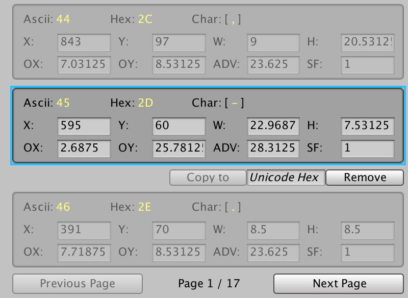 Glyph info.
The X, Y, W, and H values define character’s rectangular area in the font atlas. The OX and OY offsets control the placement of the character’s sprite, defined at its top-left corner relative to its origin on the baseline. The ADV value controls how far to advance along the baseline before placing the next character. Finally, SF is a scale factor which you can use to ajust the size of the character.
Kerning Table Info
The kerning table is either imported from a font or made manually. The table is split into pages, which you can navigate through via the buttons at the bottom. Each entry is a kerning pair with a left and a right character. The offset is relative to where the right character would normally start. A positive value pushes the characters further apart, while a negative value pulls them together.
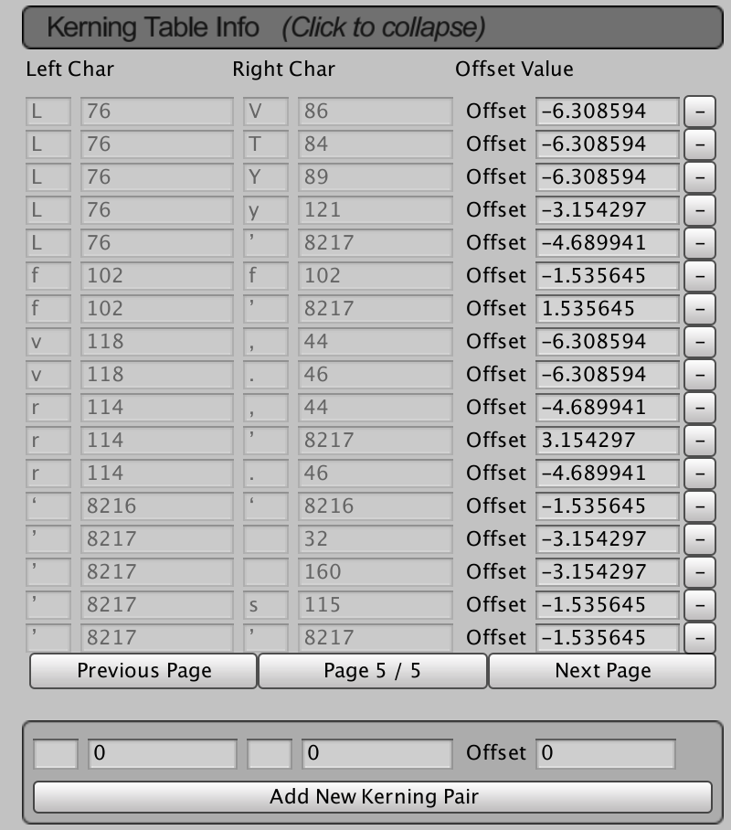 Part of a kerning table.
There are many fonts that do not include kerning pairs. You can add them manually, by specifying either the characters or their decimal character codes, plus their offset adjustment.
Unity UI: TextMesh Pro Setup
The Unity UI module uses TextMesh Pro to display text (and icons in text).
In this tutorial we’ll set up TextMesh Pro (TMP for short) to use a font and sprite asset. Make sure TMP is imported in your project (e.g. via the Unity Package Manager).
Import Essential Resources #
Import the TMP essential resources via the Unity menu: Window > TextMeshPro > Import TMP Essential Resources
Depending on your Unity/TMP version this might also be located somewhere else.
Default Font and Sprites #
If you don’t already have a font and icons to use (e.g. from a tutorial asset package), you can download a font and icons here:
TMP Settings #
Both come with ready to use TMP assets, that we’ll now use as default font and sprites. Select the TMP Settings asset, which should be located in Assets/TextMesh Pro/Resources/.
Default Font Asset #
The default font will be used by newly created TMP components as their font.
- Defaul Font Asset
Select the FFFFORWA SDF font asset (or any other TMP font asset you created).
Default Sprite Asset #
- Defaul Sprite Asset
Select the icons sprite asset (or any other TMP sprite asset you created).
Creating Own Fonts and Icons #
TMP uses special font and icon assets – you can create them easily from regular fonts and sprites (usually using spritesheets) via the context menu in the project hierarchy tab.
TMP Font Asset #
To create a TMP font asset from a font in your project, right-click on the font and select: Create > TextMeshPro > Font Asset
TMP Sprite Asset #
Similar, to create a TMP sprite asset from a sprite in your project, right click on the sprite and select: Create > TextMeshPro > Sprite Asset
You might need to adjust the positioning of your sprites, this is best handled via the Sprite Glyph Table settings of the TMP sprite asset. Adjusting the OX and OY settings will change all included sprites.
Location #
When not used as default font/icons, the TMP font/sprite assets need to be placed in defined sub-folders of a Resources folder.
Those folders are defined in the TMP Settings asset and default to Fonts & Materials (for fonts) and Sprite Assets (for sprites).
Introduction

You’ve probably run into this problem before: Creating pixel-perfect text in your Unity project can be downright messy and frustrating. Aligning your UI to pixels can also be maddening, especially if you have to fix textures’ PPU.
Don’t throw out the idea and rebuild all your graphical assets just yet, because you CAN get things pixel-perfect. I don’t know why this is still so hard in 2021 with the glut of pixel-art games out there. Unity devs, are you listening? This is a very common complaint.
Here’s a tutorial on how to do it. I’ll even throw in a bonus section at the end about getting the PPU, scaling, and multipliers right for your various UI elements.
This tutorial uses the standard rendering pipeline in Unity 2021.1 and its included version 3.0.6 of TextMesh Pro (TMP). I started this article on 2021.1.17f and it hasn’t changed for 2021.1.20f. I don’t imagine it will be materially (ha!) different using other pipelines such as URP or HDRP, or even slightly older versions of Unity. We’ll be putting this font on a standard screen-space Unity UI object but you are not restricted to this use.
It may help if you’ve gone through the Unity Learn tutorial called TextMesh Pro: Font Asset Creation, but I’m going to go step-by-step anyway.
The images here might be scaled by your browser. I took all of the screenshots on a 1080p screen at 100% scaling. If anything is unreadable, open the image in a new tab and zoom to 100%.
A nerdy word to the typeface folks out there: I’ll be calling things bitmap/raster/pixel fonts. This is not strictly correct. Check out this article for more info. TrueType fonts are vector or “outline” fonts, consisting of instructions on how to draw geometric shapes on the screen, rather than actual bitmap images. Well, even that description is slightly inaccurate, as you can have (and Apple may require) bitmap “strikes” aka embedded bitmaps. Bitmap/raster/pixel might thus be considered a category of font style.
Finding a Font
First, we need a font. Make sure you grab a font with a license suitable for your project and organization. You’re looking for fonts categorized as (somewhat erroneously) “bitmap” that are still TrueType fonts. One good place to find fonts is DaFont. I went to another site called Fontstruct and downloaded a Creative Commons 3.0-licensed TrueType font, made by user ivancr72, called Pixel UniCode. I really like this font. It’s readable, uses a 16px native font size, and has plenty of characters (2,484 in this version!) covering many languages.
If you’re getting your font from dafont, the nominal size is to the right on the red title bar for that font.


The native font size is very important. Hopefully, the author of the font has written it on the specification or download page, in the filename, or in some kind of README.
If not, you may need to count the pixels in the characters to figure it out. If you’re completely mystified, the free software Font Forge can help you measure a bitmap TrueType font. Open a tall character and estimate the number of ‘pixels’ in the font from the top bar to the bottom bar. My font here appears to be 16 ‘pixels’ tall.
Write that font size down somewhere or keep it open, because we’re going to use it several times while setting everything up.
Unity
I’ll start from scratch with an empty 2D Unity project to ensure there’s no extra clutter in the way of this tutorial.
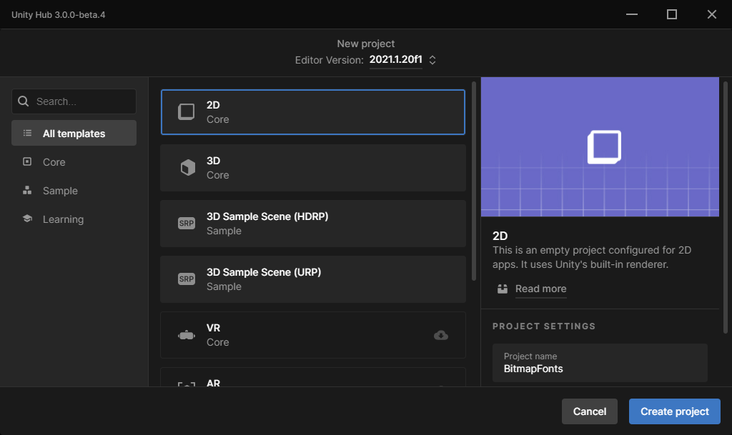
If you already have a project and a scene set up, you don’t have to make a new one to follow along.
I’ll use the absolute minimum project and scene to demo this. I’m using Unity 2021.1.20f1 and their new 3.0.0 beta launcher here, so your procedure may look different.

Set the Scene
We’re going to need the bare minimum foundational UI components to get started. That means a Canvas, which will come with an Event System… which we aren’t going to use during this tutorial.

Note that I am NOT using a Pixel Perfect camera, or Cinemachine, or anything like that. It’s simply not necessary for the UI.
Create a TextMeshPro object as a child of the Canvas.

Since this is a new project, I’ve been prompted to install the TMP Essentials, which are indeed essential to displaying text. Among other things, TextMesh Pro’s required shaders are in this collection of resources.

The new object is called Text (TMP) and may not be in a useful location onscreen, so I’m going to center it (ish) on the canvas, and get my editor view sorted out.

All right, there’s the default font. You can reference back to this if you start tweaking things and don’t have a way back to zero.
From now on, let’s look at the Text object in the Game view so we have an accurate picture of what we’re creating. The Scene view scales things.

The default font is LiberationSans SDF, size 36. It’s a nice smooth Adobe font that comes with TextMesh Pro. Keep in mind that the default size in the new TextMesh Pro object is 36 when you load your font in the next step, because your font is probably a lot smaller than this, so expect a visual mess.
Import the Font
We need our font before we can get much further. Let’s import it now.
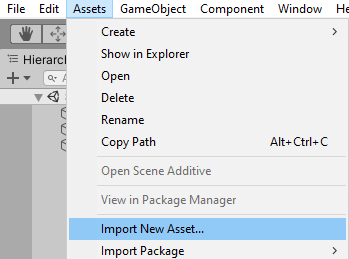
Let’s take a look at what we get initially. Highlight your new font asset in the project bay and create a TMP font asset.
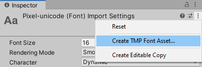

The default action is to create an SDF. It’ll be blurry if we use it now, as pictured. Chances are you’re here because you have a font that looks like the following images.


That’s not the pixel perfect text we wanted. It’s being rendered as if it were an outline font, with antialiasing and smoothing and all that. To fix this, we first need to change the import settings on the font.
Correct Font Settings

Note the default font size, rendering mode, and character set here. These are usually sane defaults for most fonts. The key word here is MOST, and they assume an outline/vector font is being imported. Bitmap fonts are special.
The “Smooth” rendering mode is the biggest reason the text is blurry. Rendering Mode needs to be Hinted Raster, since bitmap-type fonts are more like raster fonts, not smooth curves and lines.
Set the Font Size to your bitmap font’s native font size. Remember that from before?

Set Character to Unicode. You’ll gain access to all those extended characters. Even if you don’t plan on using them, you still need to do this.

If you forget, and leave the character type as Dynamic, you’ll get this error later: “Cannot generate editable font asset for dynamic fonts” / “Please reimport the font in a different mode.”
Go back to the TMP font asset creator (either in the Window menu, or the “…” menu in the Inspector) and set things up a bit differently. First, we want to explicitly specify the font size, and set it to RASTER or RASTER_HINTED. It depends on the font you chose, and there isn’t really a way to know which is appropriate up front.

We have a workable font now. Set the font on your TextMesh Pro object and set the font size to your font’s native size.
There are two common glitches that happen at this point:
- If it shows no text, when it should fit within the bounds of the object, set the font to None, then back to your font. Something happens when you save a TMP font asset and clobbers something internal. I have no idea.
- You may also need to change the font size to something else, then back to your target font size, for it to update the visuals correctly.


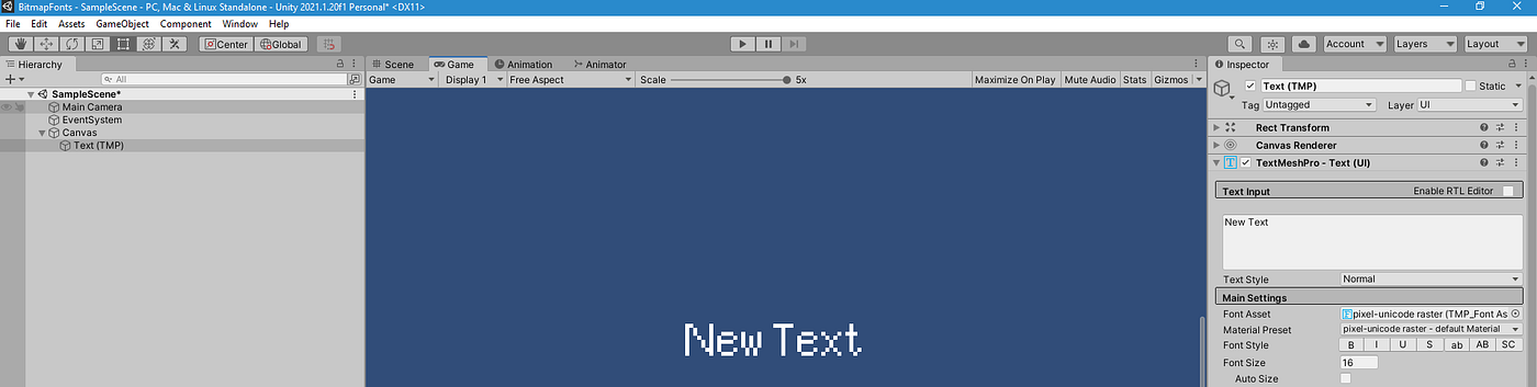
Comparison with Unity Text
If you have the font set up correctly, you won’t see a difference, and you’ll gain all of TextMesh Pro’s fancy features.

Different PPU
Suppose you have a different Reference Pixels Per Unit (PPU) on your canvas scaler, because your whole game is designed around a different size. It’s easy enough to get things synced up. The font ought to just work on a canvas as long as all of your textures and sprites are scaled correctly.
I’ll set up a pretty horrible scenario with things tuned to match each other. Let’s say you are building a pixel-perfect UI, some of your assets are a different PPU from the others.
The PPU multiplier for an image is target PPU/source PPU. So if your target canvas scaler is set to 32 PPU, and your source texture is imported at 100 PPU, then your PPU multiplier is 32/100 = 0.32.
If you’d rather (or must) use Scale instead, the equation is source PPU/target PPU. If your target canvas scaler is set to 32 PPU, and your source texture is imported at 100 PPU, then your Scale is 100/32 = 3.125. This will require you to do more math to figure out the Transform’s actual pixel size, and to set other sizes on the components as well. This is not your best option.
It’s worth noting that Unity will help you do the math. Type that math expression directly into a numeric textbox (like PPU, scale, vectors, etc.) and Unity will do the calculation for you. Once you leave the textbox the result will be stored as a number.
- Canvas Scaler: reference PPU 32
- Box background image: Imported with PPU 16. Scale 1. Image type sliced, PPU multiplier 32 (target) / 16 (source) = 2.
- Translucent checkerboard: Imported with PPU 100. Scale 1. Image type tiled, PPU multiplier 32 (target) / 100 (source) = 0.32.
- Fonts as-is, created following the article, using their normal sizes and 2x sizes to illustrate what that integer scaling looks like. Top is Pixel UniCode, bottom is Retro Gaming. See the end of this article for a link to that font.
- Icon image: Imported with PPU 32. Scale 1. Image type simple. Set to native size 32×32.
- Black and white checkerboard: Imported with PPU 100. Scale 100/32 = 3.125. Image type simple. Set native size 2.56×2.56. I don’t like this because of the extra mental math I have to do, but you might run into it.

To help align UI elements to pixel boundaries, set the anchors on your non-stretched UI elements to a corner instead of the default center anchor. This way you’ll be moving rectangles around with numbers that reflect whole pixel corners, not mid-pixel coordinates. Make sure your positions are whole numbers — no decimals!
If you go with the corner method and forget one, it will wind up in different screen locations at different resolutions. So be careful with that.
Check Your Alignment
Not your car… your pixels. But check your car once in a while, too.
There are two ways I typically use to check my pixel alignment.
One way is to use the Scene view, and zoom in until that faint small grid shows up between the lighter large grid squares. These represent pixels.
The other way is to make your own grid image to overlay/underlay your art while tweaking the layout. I like using a checkerboard and setting the alpha fairly low.


Keep Even Resolutions
If the game window is set to any resolution with an odd number, such as a width or height of 1023 instead of 1024, you’ll get weirdness in the rendered output.
About That Header, Though
The header of this article is a 5x zoom of the game window. I have a 1px resolution checkerboard (color-adjusted) behind these fonts, to demonstrate that the fonts are good.